Ergonomy of creating post

Hello !

Would it be possible to either show that the texts options can slide or to put the “+” sign further to the left, so that we find it easily on phones ?

I’m attaching a picture of my screen, it shows that, on phones, if we don’t know it slides, then we can’t find the “+”

Best regards !

1 Like

Looks like no trivial solution exists.

We could reorder the toolbar items or remove some items completely by CSS hacking.

But imo it would be really unintuitive for the plus button to be anywhere but last item.

I will upgrade the Disource version in the coming days and see first if composer changes with those updates.

Also we can keep following that thread on Discourse Meta and see if devs make the scroll more obvious.

2 Likes

Discourse updated, but no changes on composer.

@Pyetro Do you think we could reorder toolbar items so that “plus” icon would be, I don’t know, first?

2 Likes

Hello! Thanks for reporting @Donatien and @leevi for updating the platform!

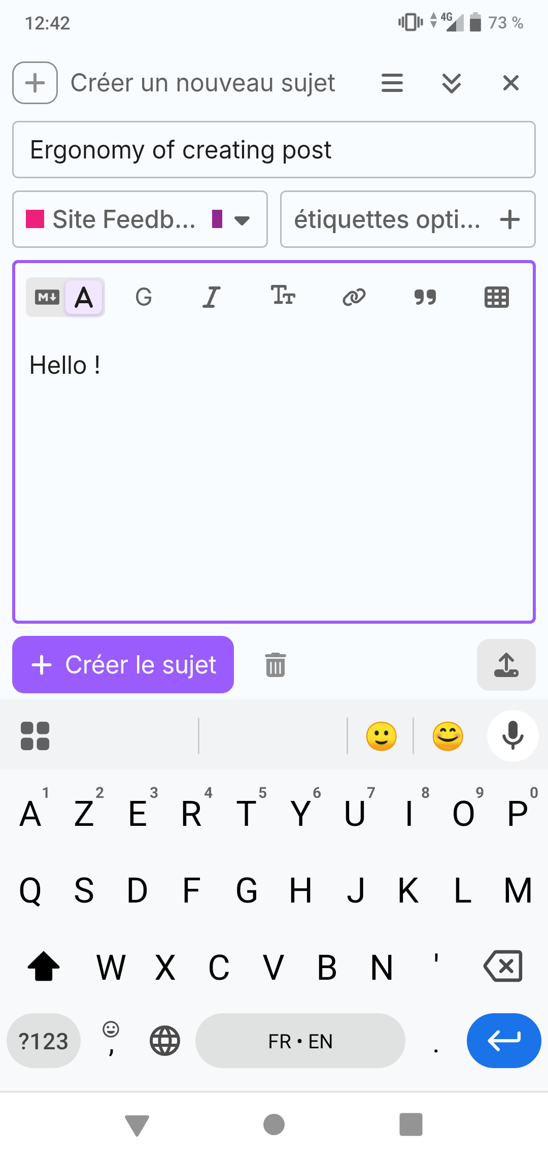
I understand what you ask, and actually it really depends on the screen size, on mine I can see some icon truncated, which is a clear sign that the bar can slides, but I can see from your screenshot that is not the same for the rest of the device.

As also pointed out by @leevi I find not really natural to have that plus btn anywhere than last, but I can also understand your point @Donatien.

I’ll try to find a solution, either move the plus btn or to add some gradient bg to suggest that area is slideable…

I’ll keep u posted ;)

Here how I see it:

@Donatien @leevi
I made some adjustment on mobile only.

Can you please test it and provide feedbacks?

Thanks

Plus icon is first now. I also see the fade, but it could be still more obvious.

I think this is improvement.

Thanks guys ! I tried it and i feel like it’s better. The shade is making us wonder what’s here so it’s nice, and the plus is really accessible :ok_hand:
Xoxo !