Let’s discuss everything to do with the design here. If you know people who are intereseted in helping out, please invite them.
shall we make a design competition for the logo and colour scheme and …? (what else?)
Raimo from Berlin is a designer who is really into this idea. we could probably have a small price of 100€ or better het some cool sponsoring perks? (Roger mentioned he would help on the mkkney side if we need it, and perro and max power or who ever sponsors the euros might also want to give something)
then we’d need do talk about timing and how to make the call.
would also be great for community engagement and build-up and for us to have a deadline :)
(props to Andy for the idea!)
I honnestly just want a cosmic background so i can really feel like im floating in the poloverse
Pasting my answer here (from email, which was addressed to MILK about the possibility of offering some price for a design competition):
We are not against being part of the development of the forum in some sort of ways but i’m (i’m talking in my name, Quentin, here) not sure that a design competition will be well receive by the community.
Generally design competitions means free work for graphic designers who are already not that well pay,
I you want my two cents you should either work with someone around you, or ask a quote/offer to graphic designers among the polo community. This way you will get real price for the job.
Then make something like an online “money pot” like ( https://www.leetchi.com ) in which the whole community could contribute to people for their work.
I don’t know, how do you feel about that ?
Maybe you should ask thru EHBA what people think about how the forum design and other maintenance fees should be assumed.
Quentin
Hi,
Yes, I agree with the points you raise and have discussed this with Remy and Andy as well as some designers and here’s the new plan we’ve come up with:
We’ll invite some designers from the polo community to supply a design proposition (logo, colour scheme, …) to us and then make a vote out of the 3-5 options we get which is open for everybody. We feel like this community participation is important and a good way to make sure the forum feels really like it is built by the community for the community.
At the same time, we’ll have a donation option at the competition so we can give some compensation to people who entered the contest.
We could just give them cash, but having a cool prize would be somehow cooler. Any ideas?
The schedule is:
Dead-line for designers: 05.07
Voting until the 12.07
And then we have until the end of July to integrate the logo and banner in a nice web design.
This would mean we can launch early August.
(soft launch and beta-testing by smaller groups of people not included, of course)
What do you think about this plan?
Trying to summarize where we are on the signal chat:
general task list, including design issues:
those design issues being:
- thumbnails for topics don’t know whatthis means, hope you do ;)
- change the initials from main categories to sth else
- reduce or remove the meta info underneath the first PM message
- possibly trying to bring back pop up PMs (bubble chat window or whatever)
- Gallery?
@Pyetro please ask if you need help / have questions / run out of tasks ![]()
Thanks @flat_humour, will do
One more request: it hasn’t been discussed yet but i would still advocate for collecting money on a voluntary basis but with a recommended amount per club member and from clubs directly.
In order to motivate peopme I would put a little badge on the clubpage for those who paid (maybe in silver and gold for the extra generous) can you tell me if that would be easily applicable?
Just having a badge on the club page? If not it could still be added to a club’s logo…
Sorry pietro ![]()
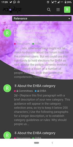
This is how it looks when I use the search function on mobile. Not ideal. Any ideas how to solve?
same issue on Android + chrome or opera
Well spmehow your space has another color…but other than that I just crolled down and you didnt
yeah, I realised that too, edited my comment but never saved the edit, upsi (:
Input Markus: Can we have a default color scheme for any given order of sub-categories? like, if you rearrange sub-categories, their associated colors will change so that no two sub-cats that are directly one above the other will have the same color for example
hey @Pyetro can you make it so all thumbnails of categories are the same size regardless of how long their respective ‘about’ text is?
I second this. looks good on PC, but in the mobile browser it’s a bit inconsistent
do we have no one to help out poor pietro? there’s loads of little issues still..
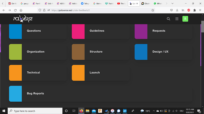
like, why tf does it do this?
four rows instead of 3 x 3?
Hi guys!
thanks @flat_humour and @momo for reporting the search result page visualisation issue, I took note on the bug spreadsheet for now!
Regarding the thumbnails of the same size, I made like you said yesterday, then commented the code to privilege the text, even if longer than the thumb height. I re apply it right now, so you can check and decide all together which is the best way to go.
Regarding the thumb colour, I wanted to apply a default colour, but I didn’t find any way other than setting it manually, but I think this is a minor issue. It’s something similar to manually change the open/pvt category slug. Each time a new category is created the slug goes automatically swapping spaces with hypens, then I manually change the slug with the syntax I proposed.. (same happen for the user groups slug). But this is really no problem for me, to check them from time to time and fix 'em ![]()
And, even if I agree in having a specific badge if a club contribute with money to the project, but I don’t really get the purpose of having a badge, maybe is something that the most of the user don’t understand or care about. Probably I’m wrong..
-1 on cosmic background. Unless it is of Cosmic. Want a polo action shot
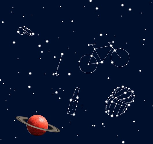
@BigTableManners , what do you think about this idea then? (obviously made by a skilled person and not someone who’s favourite font is comic sans)


